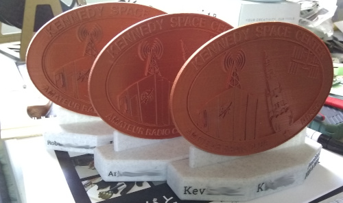
Thank Your Peers With 3D Printing
In January 2021, I made some plaques to thank my fellow officers for their service to our amateur radio club.
I used GIMP, Inkscape and OpenSCAD to convert every color of our club's logo into a different height on a 3D object. You can compare it to the texture of a coin, I guess.
I believe I've blogged about the procedure before, but if not I'm sure to get around to it eventually.
The plaque base is designed in FreeCAD. After printing the logo in copper and the base in marble (both PLA), I used a paint marker to make the text much more readable.
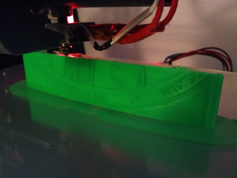 January 12th, 2021: test print(s) of the N1KSC logo. Never print your test parts in the "nice" filament.
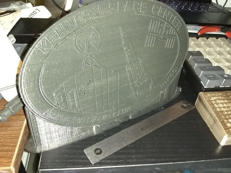 Another larger logo in black. Ultimately I thought the size was too much, but I still may put this logo to use somewhere.
The supports are still visible in this photo. I got best results by leaning the logo back a little. When completely straight, you get the most layers, which gives you the most detail. (3D printers can make complex patterns in X and Y axes, but are usually much "chunkier" in the Z axis) Your slicer may decide to put supports on the front side, though, which can be ugly.
The print is also much more stable with a wide base thanks to the support pillars, which only touch the back. Just 5-10 degrees rotation should suffice.
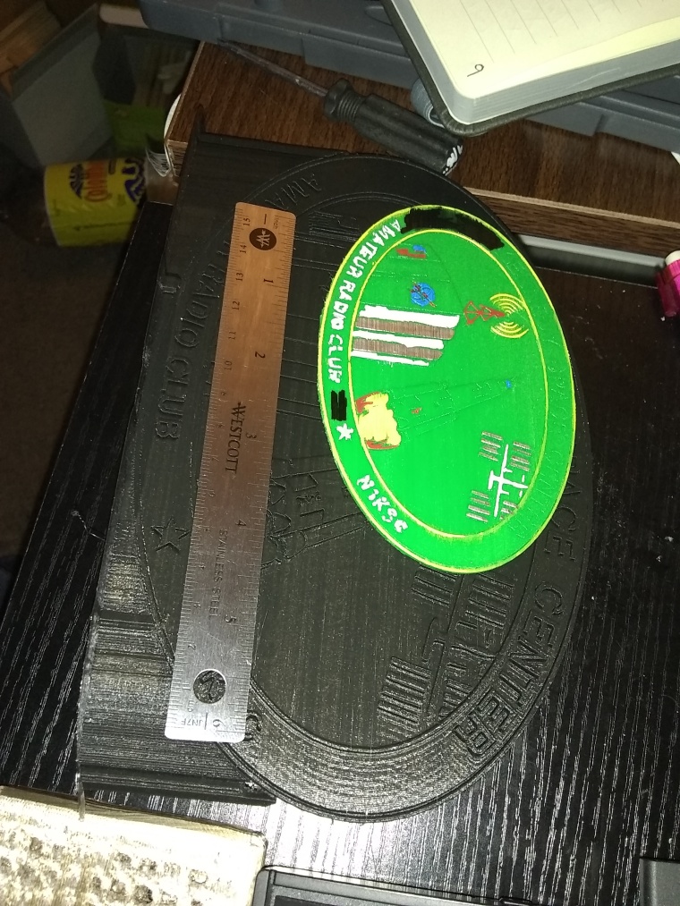 This is the final plaque size compared to the oversized one. This was about the time I decided that flat logos wouldn't be enough on their own and I needed a plaque base.
I also tried painting with paint markers. It wasn't tidy enough nor did the colors match closely enough. Using copper was an aesthetic choice: it's not 3rd place to Hams, it's our 1st choice of conductor. ...Until we get one of those asteroids with 1000x the world's supply of gold on it, then I'd like gold cables, please.
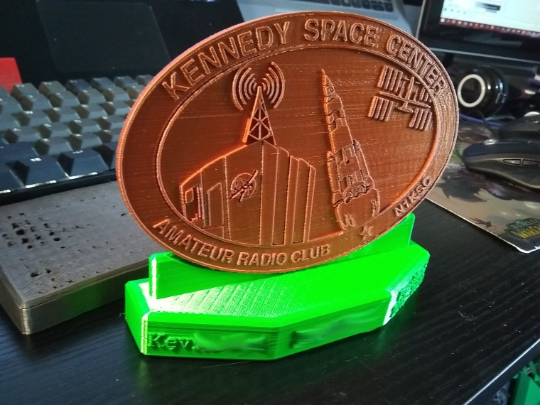 After several test prints of the little "plaque holdery pop-up bit", I got a snug fit between the logo oval. I was also testing the text extrusion length and my maker's mark on the bottom.
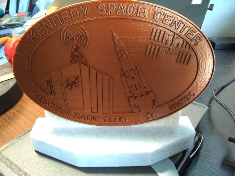 With a good fit in test plastic, I moved on to printing the final pieces. During this stage I swapped the text for the two other plaques.
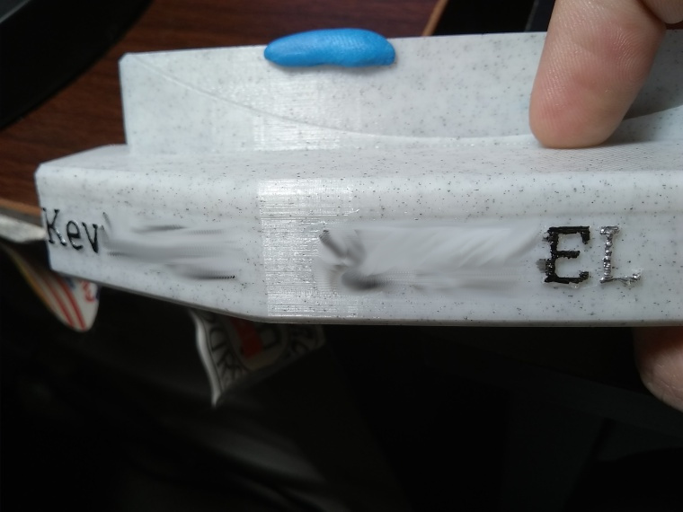 Paint marker tests. I didn't like the look of silver: it was too shiny to actually read.
This text also had a CAD / Slicing / 3D printing issue. If you look closely, the painted letters have a bubbly, rough texture. The extruded text didn't intersect the plaque surface, and my 3D printer interpreted it as a separate solid. It's only adhering due to the fact that you can't print in mid-air, so my printer was slamming a little glob into the wall lines instead of actually drawing the text. I noticed this before printing the rest of the plaques, but after switching out my test plastic for the good stuff!
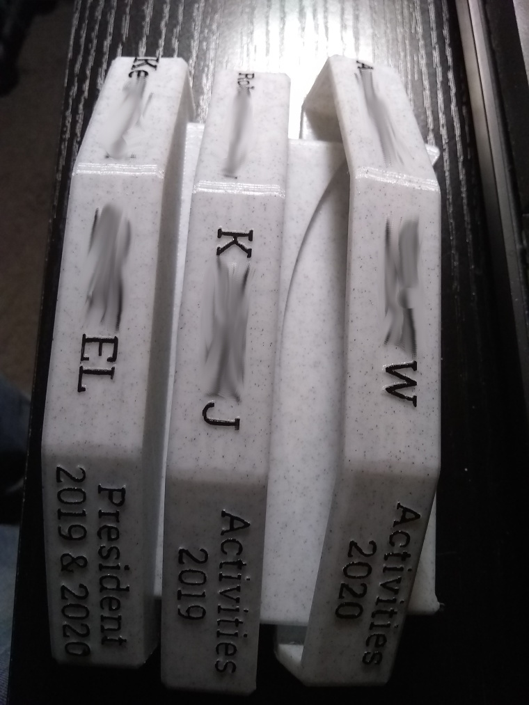 All three plaques - sorry for the privacy smudges, but trust me, the text looked awesome.
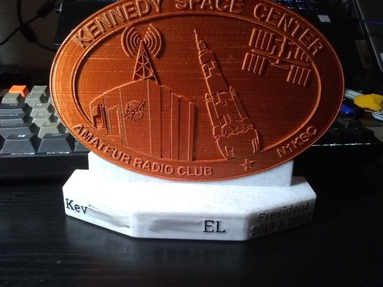 Glamour shot.
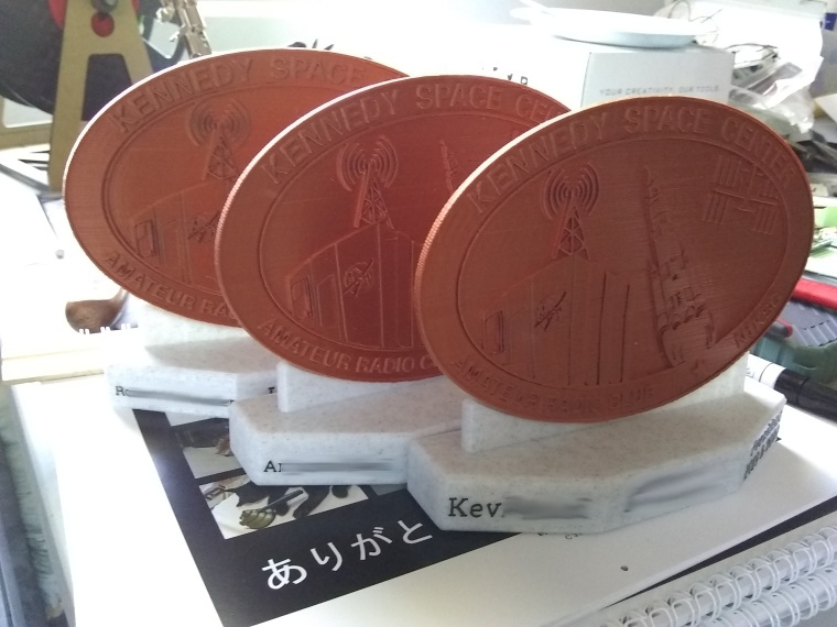 The final plaques.
Challenges and Setbacks
The oval on the logo is an approximation from an image, and the oval cutout on the plaque is a cutout of an ideal oval. It took several tries to get them to match.
The plaques aren't solid bases, and have quite a bit of overhang. So there's a bit of a pocket in the bottom of them, to save on infill and give me a spot to leave my maker's mark, but it took some iterations to get the infill and wall thickness to values that gave a stable, printable plaque base.
Favorite Part
The gift-giving and letting my fellow officers know they're appreciated.
What I Learned
This is my first project with extruded text in FreeCAD. It's just as easy to cut away text and emboss, but that is difficult to cleanly paint, so I stuck with extruded text for this use case.
Any Future Potential?
In fact, I'm glad I came across this backblog image set, because I need another for another officer who's rotated out of our club.
I wouldn't mind applying the technique to other logos or plaque designs in the future!
Due to the high level of identity exposure Hams have to endure, the names and callsigns of the plaque recipients have been scrubbed from the images. They received the plaques as an unsolicited surprise, and they sure didn't ask me to write a blog post about them.
This article is a backblog, in which I use a template generation script to turn folders of /images into a quick and dirty showcase of something I spent my time on.